


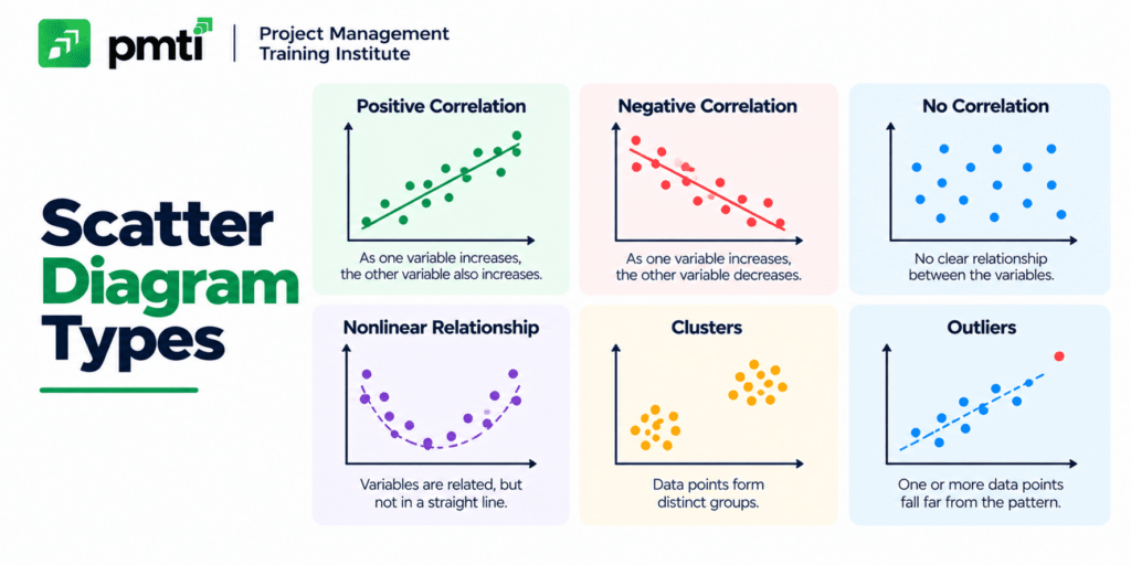
Scatter Diagram Types: 6 Patterns, Examples, and PMP Exam Tips
A scatter diagram has 6 common types: strong positive, weak positive, strong negative, weak negative, no correlation, and nonlinear. Each type describes the direction, strength, or shape of the relationship between 2 variables. The scatter diagram is 1 of the 7 basic quality tools.
The PMP exam shows a plotted graph or describes one in words and asks what relationship it proves. This article defines the scatter diagram, explains the 6 types with examples, shows how to read the correlation coefficient, lists 5 build steps, and separates correlation from causation.
What is a scatter diagram?

A scatter diagram is a graph that plots paired data for 2 variables, 1 on each axis, to test whether they are related. It is also called a scatter plot or X-Y graph. The independent variable sits on the x-axis and the dependent variable sits on the y-axis.
PMI’s PMBOK Guide defines the scatter diagram as a graph that shows the relationship between 2 variables. Each dot is 1 observation. The pattern of the dots reveals the type of relationship.
Scatter diagrams serve 3 purposes:
- Identify potential root causes of a quality problem.
- Test whether a suspected cause and an effect are related.
- Confirm that 2 variables move together before a team acts on one of them.
What are the types of scatter diagrams?
Scatter diagrams fall into 3 groups by direction (positive, negative, none), 2 groups by strength (strong, weak), and 2 groups by shape (linear, nonlinear). Combined, they produce 6 patterns that appear on the PMP exam.
| # | Type | Pattern | Example |
|---|---|---|---|
| 1 | Strong positive | Dots form a tight line rising from bottom left to top right | Temperature and cold drink sales |
| 2 | Weak positive | Dots rise left to right but spread widely | Advertising budget and sales |
| 3 | Strong negative | Dots form a tight line falling from top left to bottom right | Temperature and winter coat sales |
| 4 | Weak negative | Dots fall left to right but spread widely | Weekly work hours and productivity |
| 5 | No correlation | Dots scatter randomly or form a flat line | Shoe size and intelligence |
| 6 | Nonlinear | Dots follow a curve instead of a straight line | Team size and output, rising then flattening |
Three terms decide the classification:
- Direction: positive means both variables rise together; negative means 1 rises while the other falls.
- Strength: the tighter the dots hug a line, the stronger the correlation.
- Shape: a curve signals a nonlinear relationship that a straight trend line misdescribes.
What is a positive correlation scatter diagram?
A positive correlation scatter diagram shows both variables increasing together. The dots slant from the bottom left to the top right. A tight cluster indicates a strong positive correlation, and a wide spread indicates a weak one.
Project example: as the number of code modules grows, test hours grow. If 20 of 20 plotted projects follow that line closely, the correlation is strong. If only a loose upward drift appears, the correlation is weak.
What is a negative correlation scatter diagram?
A negative correlation scatter diagram shows 1 variable increasing while the other decreases. The dots slant from the top left to the bottom right. Tight dots mean a strong negative correlation.
Project example: as inspection frequency rises, escaped defects fall. A team uses this pattern to justify a higher inspection rate.
What does no correlation look like on a scatter diagram?
No correlation appears as dots scattered across the graph with no slope, or as a flat horizontal band. The 2 variables are unrelated, and changing 1 does not predict the other.
A team that finds no correlation between meeting length and defect count removes meeting length from its list of suspected causes. This result narrows the search for the real cause.
What does a nonlinear scatter diagram show?
A nonlinear scatter diagram shows a relationship that follows a curve. The variables are related, but the rate of change shifts across the range. A straight trend line understates the relationship, so teams fit a curve.
Example: output rises as a team grows from 3 to 7 people, then flattens as communication overhead grows. A straight line fitted to the data hides the plateau.
How do you read the correlation coefficient?
The correlation coefficient (r) measures the strength and direction of a linear relationship. It ranges from −1 to +1. A value near +1 is a strong positive correlation, near −1 is a strong negative correlation, and near 0 is no linear correlation.
| r value | Interpretation |
|---|---|
| +1 | Perfect positive linear relationship |
| +0.7 to +1 | Strong positive |
| +0.3 to +0.7 | Moderate positive |
| −0.3 to +0.3 | Weak or none |
| −0.7 to −0.3 | Moderate negative |
| −1 to −0.7 | Strong negative |
| −1 | Perfect negative linear relationship |
The 0.3 and 0.7 cut-offs are a common convention, and fields differ on the exact bands. The coefficient measures linear relationships only, so a clear curve can produce an r near 0. Always inspect the plot before trusting r.
How do you create a scatter diagram?
Create a scatter diagram in 5 steps: select the variables, collect paired data, plot the points, read the pattern, and confirm the finding with another method. Spreadsheet software such as Microsoft Excel plots the points in under 1 minute.
Follow these 5 steps:
- Select an independent variable and a dependent variable, both measured with objective numbers.
- Collect paired observations, with at least 30 pairs for a reliable pattern.
- Plot the independent variable on the x-axis and the dependent variable on the y-axis.
- Read the direction, strength, and shape, and mark any outliers.
- Confirm the finding with a root cause method such as the 5 Whys before changing the process.
Three conditions protect the result: the data covers a wide range of x-values, the observations are paired from the same period, and the axes are labeled with units.
Does a scatter diagram prove cause and effect?
A scatter diagram proves correlation, not causation. A visible relationship has 3 possible explanations: X causes Y, Y causes X, or a third variable drives both. Only further analysis establishes the cause.
Ice cream sales and drowning incidents rise together in summer. Temperature drives both, so neither causes the other. A project manager treats every scatter pattern as a hypothesis and tests it before acting.
The fishbone diagram supplies candidate causes, and the scatter diagram tests whether a candidate moves with the effect. Read how the 2 tools pair in cause and effect diagrams for PMPs.
What are the advantages and limitations of scatter diagrams?
Scatter diagrams have 4 advantages: they reveal patterns visually, expose outliers, cost nothing to build, and need no statistics background. They have 4 limitations: they handle 2 variables, show no causation, hide overlapping points, and give no exact strength.
Advantages:
- Visual pattern: direction and strength appear at a glance.
- Outlier detection: a point far from the pattern signals a data error or a special case.
- Low cost: hand sketches and spreadsheets both work.
- Plain language: stakeholders read the chart without training.
Limitations:
- Two variables only: a third factor needs a separate chart or a matrix.
- No causation: correlation requires follow-up testing.
- Overlapping dots: large datasets hide the distribution.
- No exact strength: the plot gives a visual impression until the team calculates r.
For multi-variable comparisons, a team switches to matrix diagrams.
Where do scatter diagrams appear in the PMBOK Guide and the PMP exam?
PMBOK Guide 6th Edition lists the scatter diagram as a data representation technique in the Manage Quality and Control Quality processes. The exam tests type recognition, correlation versus causation, and tool selection in scenario questions.
Prepare with these 5 actions:
- Identify the type from a described pattern, such as “as X rises, Y falls” meaning negative correlation.
- Reject any answer that claims a scatter diagram proves causation.
- Select the scatter diagram when a question asks whether 2 variables are related.
- Select the Pareto chart to rank problems, the histogram to show distribution, and the control chart to track stability over time.
- Recall that the scatter diagram is 1 of the 7 basic quality tools.
About 60% of the 2026 PMP exam sits in agile and hybrid contexts, and quality tool questions appear in those scenarios as well. Practice scatter diagram questions in guaranteed PMP certification training from Project Management Training Institute.
